Strawburied Campaign
About: Strawburied is a company whose mission is to address the issues related to the dangers of the plastic waste in our environment—specifically plastic straws. The plastic straw represents the unnecessary waste and consumption plastic makes.
Brief: My job was to conceive, design, and execute a logo, subway car advertisement cards, and Instagram ad for Strawburied. The logo was to be done in one color, two colors, and full color and needed to include the tagline “Put Plastic Straws to Rest.” The subway car advertisement needed to include an eye catching, attention grabbing, and clever headline. It must include body copy, incorporate the logo, include a visual, and include web address. The three Instagram ads must include a call to action. They should work together as a campaign and appear thematically similar. They can not be identical to the subway ads. The poster needed to explain the dangers of straws and plastic and direct people to visit the Strawburied website. It needed to include an eye catching, attention grabbing, and clever headline.
Solution: From the beginning of the project I knew I wanted to convey a message about the effects of our use, abuse, and disposal of plastic and its effect on the environment and sea animals. The grim reaper and the rectangular tomb shape were used to symbolize death at the hand of the grim reaper’s “straw” scythe.
LOGO: The shape of the scythe itself made the design more difficult to balance. The dark rectangle helped to give visual weight to the design to the opposite side of the scythe.
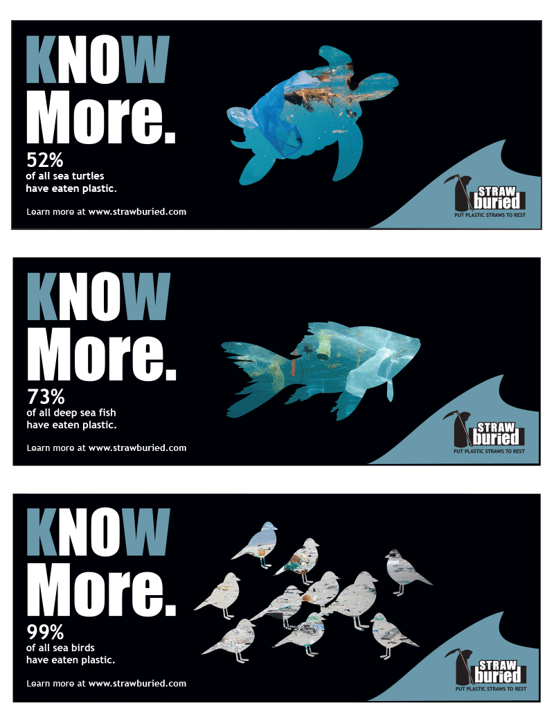
LOGO CHALLENGE: Due to the dark nature of the logo itself, it was difficult to see on the black background of the subway ads, the Instagram ad, and the poster. The small blue wave behind it was needed to make the logo itself more visible.
CALL TO ACTION: The “Know More” call to action was meant to have a double meaning based on the contrast between the “k” and “w” and the rest of the letters. “Know More” directed people to go to the website to learn more. “No more” means let’s put an end to our use, abuse, and disposal of plastic items.
IMAGERY: The purpose of the silhouetted sea creatures was give the viewer a sense that these poor creatures were not only ingesting plastic but that they were full of it.